In Search of Menu Clarity
Lately during critiques, we’ve been talking a lot about menus and navigation patterns. At this point it’s safe to say that mobile-first menus are a widely used and understood mode of navigation... But how can we make that experience as clear as possible to all potential users, without just assuming that people know how to interact with something?
We tested a handful of recent launches that represented a variety of navigation patterns: Fully Hidden, Partially Hidden, Traditional, Hamburger Icon, and variations on the iconography and labeling. This is what the results are telling us (at least for now).
Choosing a Direction
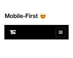
Yes, the mobile-first menu has really become a way of life. We can (somewhat) comfortably say that most users know what clicking a menu button (hamburger) does or where to look for one if a traditional menu is not present. However, hidden and exposed navigations each have their benefits.
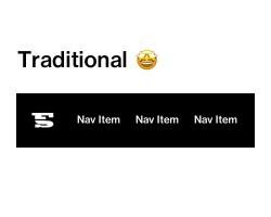
There is something to be said about a good ole traditional menu — big, beautiful type across the top of a page, a nice pop of color... Especially when that menu is highlighting a more streamlined site architecture with direct user pathways. In these instances, do we really need to put an extra click between users and navigation? Probably not.
(Not to mention that opening a full takeover menu to just a couple of links is pretty disappointing. Just us? We can’t be the only ones who feel this way.)
On the other hand, a traditional navigation can look just plain overwhelming sometimes. When you’re dealing with multiple levels of navigation – from main navigation, calls to action, audience-based navigation, you name it – separating the experience happening on the rest of the page from the organization of all those links is incredibly helpful.
Keep It Simple
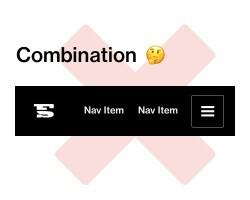
All of that information is pretty straightforward – we know. Here’s something that our research did tell us though… Combining those approaches is confusing. And confusion leads to navigation items going unnoticed.
Users understand a traditional approach. They also understand a mobile-first approach. But when you try to put navigation in multiple places and different modes, they don’t know what they are supposed to interact with or where to find what they need. So, just pick a direction and make it easy on them.
All About the Context
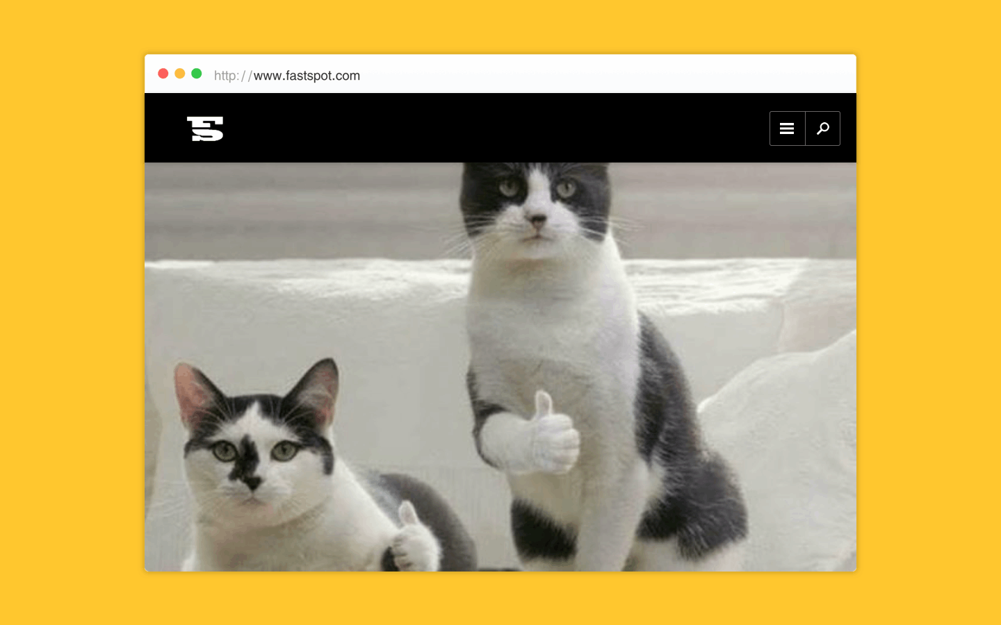
This brings us to the notorious menu and search icons. Name a more iconic duo – We’ll wait.
We interact with these bad boys daily but, without making assumptions about user skill or knowledge, does an icon alone provide enough information about such an important piece of functionality?
We’ve found that giving users additional context through text makes these items all the more clear. In fact, with every test completed that used an icon and text combination, testers automatically looked at that first and knew exactly what it was. No question.
Seriously, Keep it Simple
For a while, we were very excited about the idea of decluttering our designs even more by combining those familiar icons into one “super-icon”. Often times the search functionality is in the menu, so it made sense to indicate to users that these things were in one place.
Here’s the thing though – each of those icons has context individually. By combining them, you are putting them in a different context and changing their meaning. “Is this searching a document? What even are those staggered length lines? Where’s the menu? We don’t know!” And neither did testers.
We still wanted to give users that important indication though – so we’ve found a solution that (we think) covers all the bases while maintaining simplicity and accessibility.
Separate those icons (and text combos *wink wink*) into their own buttons. When the user hits ‘menu,’ it simply opens the menu. When they hit ‘search,’ the menu still opens but with the focus already on the search bar. This not only visually helps with finding search in the menu and directing the user to an action; but it makes the menu more accessible to audiences using a screen reader.
So to say it again for the people in the back, “KEEP IT SIMPLE” That phrase is a staple in almost any design advice ever given for a reason.
And when in doubt, think about the context of an item... Then provide a little bit more.