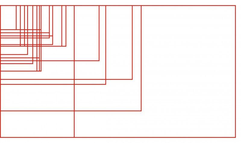
The Fold Does Not Exist
If you work in any web-related industry, let this become your new mantra.
“The fold does not exist. The fold does not exist. The fold does not exist.”
Breathe deeply. “The fold does not exist.” Relax your shoulders. “The fold does not exist.” Feel the Zen.
There are a lot of content hierarchy and design decisions that go into creating a successful website. Whether or not content is above the fold is not one of them. Here’s why.
A Brief History
The concept of the fold is a holdover from the days when news was printed on paper, folded in half and displayed in newsstands. The most important headline of the day was set at the top of the front page, making it visible above the literal, physical fold.
Even in this context, the fold represented nothing more than a hierarchical decision. It was simply a measure of grabbing attention at a glance. No editor was ever concerned that readers would not know that opening a newspaper would reveal more content.
At Fastspot, we design a lot in the higher education space. Most of our clients’ target audiences have probably never even opened a newspaper. The fold does not exist for them, and it never did. The only ones for whom the fold does exist are a site’s content managers. And even for them, it only exists (or should exist) as an anachronistic term for prioritizing content. Because once again, when it comes to the reality of the internet—the fold does not exist.
Which Fold Are You Talking About, Exactly?
When it comes to the wide world of the web, that world is responsive. Meaning that content shifts, reformats and adapts its presentation for different devices. And there are countless devices—and even more screen sizes—to account for. If the fold actually existed (it doesn’t), each and every one of those different resolutions would have a different fold.

Trying to keep track of every fold line in terms of pixel count would be exhausting. Designing and developing for everyone of those breakpoints so that a certain piece of content is always visible just doesn't make sense. It wouldn't be a good use of time or budget.
Everyone Knows To Scroll. Really, They Do.
Another pressing question we get from clients is whether or not users know to keep scrolling. The answer is always yes. Yes they do. Promise.
Not only do users know to scroll, but they will scroll—especially if they are looking for something in particular. Just think about sites like Amazon or Bloomberg News—or even your Facebook feed. All of these are long scrolling experiences. Yet people of all ages and demographics successfully interact with such sites on a day-to-day basis without even thinking about it.
Mobility Breeds (Scroll) Motion
The internet is officially consumed more frequently on mobile and tablet devices than it is on desktop or laptop computers. Touch screens are the norm in the mobile world. Combined with their smaller screen sizes, this leads to intuitive scroll and swipe motions to reach additional content.
Here’s a challenge. Go pull up this article on your phone, hover your thumb over the screen and hold it there for a second. Ok, now here comes the hard part—I triple-dog dare you to not scroll. Feels pretty weird, right? Your thumb just hanging out there, all useless and all. Life is full of teachable moments. File this one under “The Fold Does Not Exist.”
This is Why There are Designers
If you still don’t trust that your users will scroll, we’d be glad to send a scroll enforcement officer to everyone’s house and… No, seriously though. If you’re still concerned about the fold line, there are plenty of visual cues that designers can add to a site indicating that there is more down the page to explore.
The most obvious of these are the ubiquitous down-arrows and maybe even some helper text that says “scroll.” These are ok, but studies show that they only add clarity for less than 10% of users. For the other 90+% they are little more than visual clutter.
A more subtle solution is putting a percentage-based maximum height on the feature (or “hero”) area of a site. By adding some code that checks the height of the user’s browser window, subsequent content can often be pulled up to where it is peeking up from the bottom of the browser window. This gives users an unobtrusive hint that the page continues beyond what is currently in view.
The other option—the one we’d recommend—is good old fashioned trust. Trust that we’re being honest with you. Trust that your users know what to do. And trust that the fold has truly gone the way of the Dodo bird.