
Navigation Conventions Can Only Take You So Far
All conventions serve a purpose, but you can't use the same one for every user.
Web conventions are patterns that users have become accustomed to over time. For example, the logo of an organization being in the top left hand corner of the website could be considered a convention. The main benefit of conventions is that they help to reduce confusion because users know what to expect. In this day and age, almost every navigation interface has a design that can be considered “standard,” but without considering who your users are and why they are visiting your site, using even a tried and true convention cannot guarantee that people will be able to effectively use your website. It could even be detrimental to usability if it isn’t the right convention for your users.
Let’s work through this a bit. When I ask you to think of a standard webpage, you probably think of something like this.
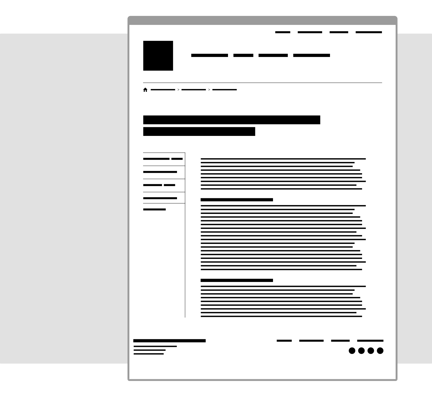
Logo on the top left, a bar of navigation across the top, and a left-hand sidebar with more navigation. Maybe there is also a search icon in the top right.
This layout is great because you probably could have named what each of those sections is without me telling you a thing. Many other websites use this layout, and the familiarity helps to create trust and establish credibility.
But what happens when having an exposed main navigation and sidebar navigation is too much information for a user? Or when you know that most users don’t enter your site from the homepage, so knowing where you are in the website is really important? Or when a majority of your users are either very young or may be unfamiliar with web conventions? That very recognizable layout starts to fall apart.
So what do you do? It might be tempting to just ignore all conventions and create something brand new, but don’t throw the baby out with the bathwater just yet. Just choose carefully.
Let’s consider how a couple of larger demographic groups may navigate a site.
For the teenaged user
Neilsen Norman recently published research about website behaviors of teenagers. The findings showed that, although teens tend to be more fluent in various technologies than other age groups, they are also quick to make decisions and are very error-prone. Basically, they aren’t really thinking about the actions they are taking. They are not trying to understand the context in which they find themselves. They are not exploring all of the options before making a choice. They just go.
For Fastspot, this means that we have to reconsider the use of things like mega menus when we know our users are young. Although mega menus have been shown to be effective, they could increase the number of errors a teenaged user makes because there are so many options. Mega menus are great for providing context, hierarchy, or categorization, but for a teenaged user who is not going to take the time to observe those things, it could do more harm than good.
For the 65+ user
Senior users make calculated decisions, have a low tolerance for change, and are more likely to blame themselves for being unable to complete a task. They are also twice as likely to give up on a task. This is a group that wants to process all of the information before making a decision. Typically, it would make sense to use a menu with an accordion or a mega menu to allow the maximum amount of information to be displayed without a user having to make a decision. But there is more to consider. Senior users also have decreased dexterity. So menus that have small interaction spots or wide menus that require a user to move a mouse diagonally in a specific area can be frustrating for these users.
This is probably the group where decisions about navigation require the most scrutiny. It has to be simple, with little to no movement. It has to provide enough information to make a decision, but not so much that it is difficult to remember what you just read. And, if you are redesigning something that already exists, is there a way to change it as little as possible? Because of this, I don’t think any navigation convention without some adjustments is suitable for seniors.
In other cases, a user group may be influenced not by a demographic category, but by their expectations for the particular site.
For the user who needs you to focus them
Fastspot is currently working with an undergraduate college where the students using the website do not understand the information with which they are being presented. They don’t know what information they are going to get, where they are going to go, or who owns the content. In cases like this, we want to make everything simple. Unfortunately, sometimes simple can get misinterpreted as traditional, and those two things do not always line up one-to-one.
Our solution was to hide a lot of the traditional navigation. The main navigation is in a hamburger menu, even on the desktop. And the sub-navigation is in an accordion drawer that only shows the direct children of the page you are on. I know that sounds scary, but it was a deliberate choice to reduce the number of options available to a user and to force them to use the page content to navigate. It also gives the client space to explain what each piece of information is for and why it should be used. We know that users scan more than they read, so we wanted to make sure they were scanning content that was most useful to them instead of being distracted by more options than necessary.
Navigation standards and conventions are essential. They are one of the things that has helped to make the web easier to use. I also recognize that design and patterns are not the only things that make a navigation system effective. No convention will ever save you from having a nonsensical information architecture. But with more and more people accessing the web, we have to start asking ourselves if the conventions we have developed really benefit all people. Figuring that out is difficult and should be done very carefully and thoughtfully, but if we find that something isn’t going to benefit our users, we need to be willing to defy convention if doing so will ultimately lead to a better experience.